Under the book cover
Designing a book cover is a lot of work.
Fortunately for me, Andrew is doing all of the hard stuff. I can look at an image and point out things I like or dislike, but coming up with the content in the first place is excruciatingly difficult for me.
Last weekend hammered this point home, as if I needed more clarification. Andrew had put together three possible cover designs, all incorporating a house in some way. I love this concept because Emma, the protagonist, is trapped in the house she was murdered in, and therefore the house is a major presence in the story. Out of the three designs, one jumped out immediately. The next step was for me to review potential images and fonts and provide Andrew with feedback so that he could make the cover fit the story even more.
Omg.
One long and grueling weekend later I had come up with twelve potential house images, more than twenty font options, no new alternatives for the background image, and a significant amount of my hair had turned white. Fortunately I dye my hair so no one can tell, but I know it’s there.
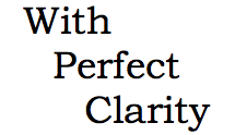
For example, suppose the title was in this font:
That seems good enough, doesn’t it? But it makes sense to look at another for comparison, say:
I like the ‘P’ better in the second version, but then the C has those little bars on the edges. So maybe there’s a better alternative; possibly this one:
That one is nice too. It’s also wider than the other two – but is it too wide? Maybe the words should be larger and spread out a bit, like so:
And now you can see that the size of the font changes how you feel about it – at least it does for me. I liked the ‘a’ better in the third example – now it feels a little misshapen even though it’s the same font type. Maybe another font with different word placement…
Better? Worse? Throw in font colors, transparency (or not), multiple images…ack!!!!!
I find the power elements of a cover can have to be fascinating. Some fonts feel like they encourage the viewer to read the story, whereas others do just the opposite. Do they really? I have no idea. But it seems logical. It’s also been interesting to see the difference between the large cover, like what you’d see on a hardback or paperback, and the thumbnail image, which is what you’d see if you were browsing on a site like Amazon. A design might work well for the larger image, but not the smaller – for example, the house and background images blended together in the thumbnail for the first version of the current design. That was fine because that version was intended to be a proof of concept, but it was a good lesson for me because it took me a full week before I thought to look at the thumbnail. (I’m sure Andrew knew all of this from the start…remember I said this is not my strong suit…)
At least I knew up front that this was not my forte, so Andrew gets to do what he’s good at, I can provide feedback – which feels doable, now that we’re past the initial image and font selection – and I can focus on something fun, like wrapping up the last few manuscript revisions!


