Squeaky toys and fonts
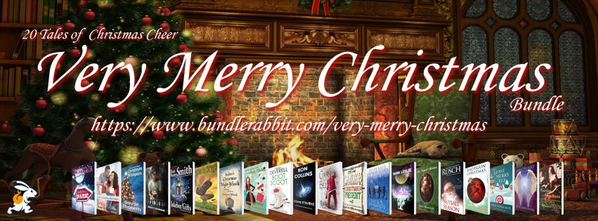
The Very Merry Christmas bundle is only available for purchase on the BundleRabbit site for one more week! It will be available elsewhere after that, but if you purchase it through BundleRabbit you can donate 10% of the purchase price to either the Leukemia & Lymphoma Society or The Humane Society of the United States.
I’ve been working on both the cover and the manuscript for “The Scent of Roses,” my short story that will be in the Haunted bundle. I’ve been experimenting with different fonts, which is not only really fun, it’s also quite time consuming. 🙂 My hope is that I’ll be able to find one font that will work for any ghost story I write – that way every time I put out a new ghost story I’ll know exactly what font to use, and theoretically my ghostly covers will match.
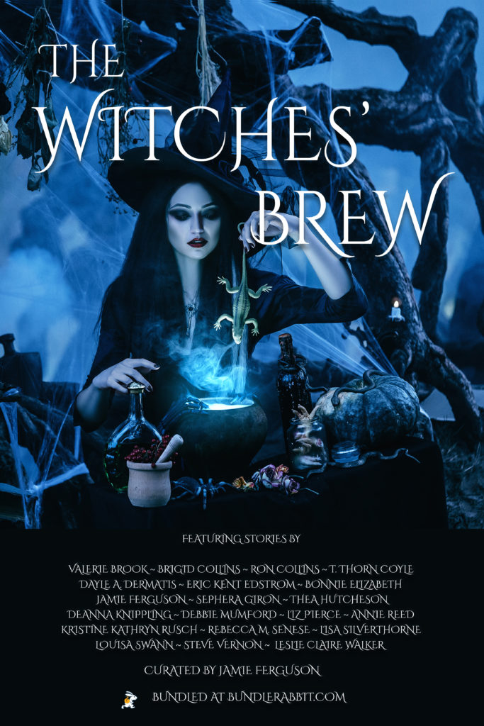
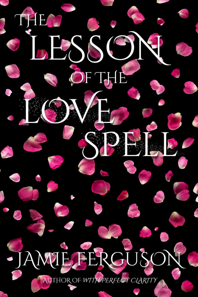
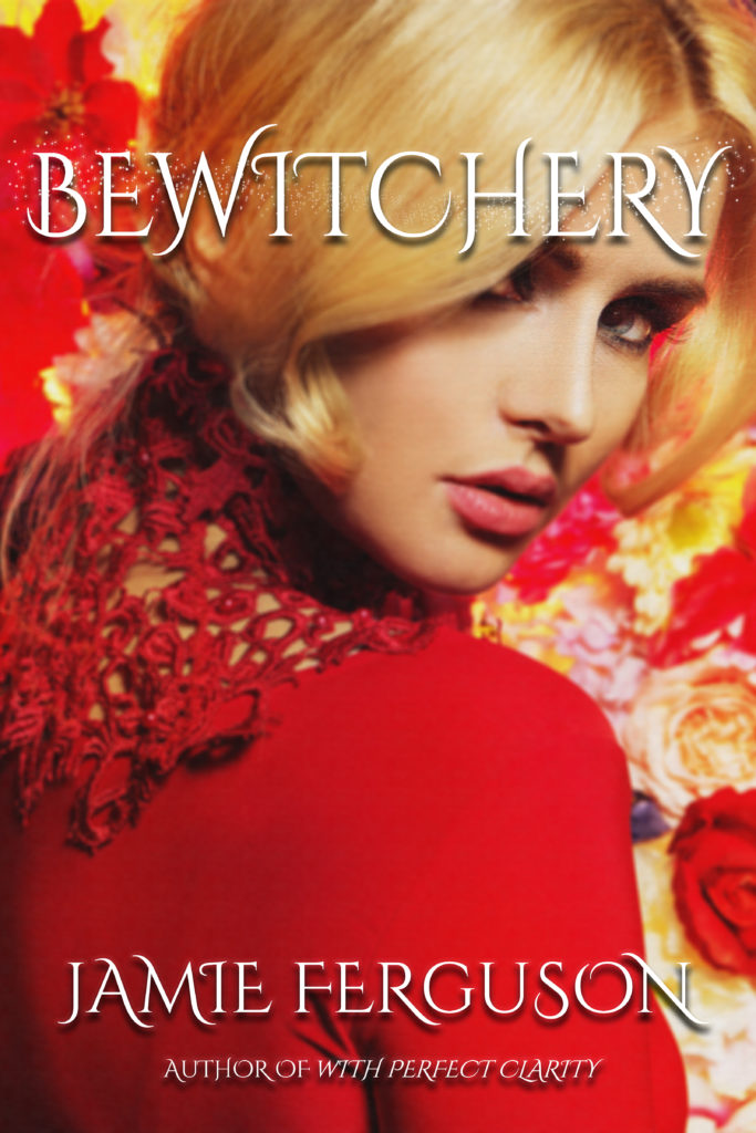
For example, here are the three witchy covers I’ve created so far – they all use the font Cinzel.
That font totally works for witch stories! And it would probably work for some ghost stories as well, but not all of them. And while I know there’s no guarantee that any one font will work for all stories in a category, it’s definitely nice to have the covers of similar stories look a little like each other.
That applies to the layout of the text as well as the font. In both “The Lesson of the Love Spell” and “Bewitchery” my name and the author tag (the “author of” line below my name) are in exactly the same place. That’s really simple to do (especially since I essentially have a witch cover template now), but it’s also nice because the two covers look like each other. The title text is sized differently because “Bewitchery” had to be in a smaller font so it would fit, but overall the two have the same general look and feel.
Yes, I am a little obsessive about this, but I’ve spent hours over the past few days fiddling with cover images, fonts, moving things around pixel by pixel… The fact that I have border collies should come as no surprise… They just obsess over tennis balls and squeaky toys instead. 🙂
